Close your eyes for a second and picture Coca-Cola. That red came to you immediately, didn’t it? Now think of Tiffany & Co. The blue box showed up just as fast. Neither of those is an accident. Those colors were chosen deliberately, tested carefully, and reinforced over decades because color is one of the most powerful tools a brand has — and most people never consciously notice it working.
That is color psychology in logo design. It is the science of using color to trigger specific emotions, build recognition, and communicate brand values before a single word is read. This guide breaks down exactly how it works, what each color communicates, and how to apply it to your own brand.
- Why Color Psychology in Logo Design Actually Matters
- Breaking Down Color Meanings: Your Brand Logo Color Psychology Crash Course
- Getting Strategic: Color Psychology for Business Logo Success
- Building Brand Game Plan : Color psychology in Logo Design
- Nailing Those Color Combinations
- Making Color Psychology Work in Real Life
- Final Thoughts
Why Color Psychology in Logo Design Actually Matters
Color psychology in logo design is not just designer theory — it’s real science backed by decades of marketing research. Colors trigger emotional responses and communicate meaning before a single word is read.
Consider this: color can increase brand recognition by up to 80%. The human brain processes visual information 60,000 times faster than text, which means when someone sees your logo, their brain has already formed an impression based on color before they’ve registered your company name. That split-second response is what color psychology in logo design is designed to influence.
The brands that get this right don’t choose colors because they look nice. They choose them because they work.
Breaking Down Color Meanings: Your Brand Logo Color Psychology Crash Course
Every color in the spectrum carries psychological associations that have been reinforced through culture, nature, and shared human experience. Here is what each major color communicates in a brand context:
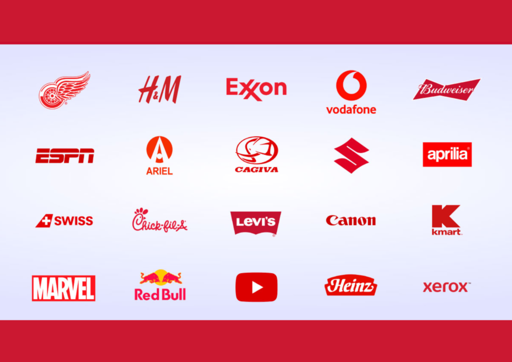
Red — Energy, Urgency, Passion
Red is the most visually dominant color in the spectrum. It raises heart rate, signals urgency, and demands attention immediately. Netflix, YouTube, and Target all use red to create excitement and drive action. It works particularly well for brands that want consumers to feel stimulated or act quickly.
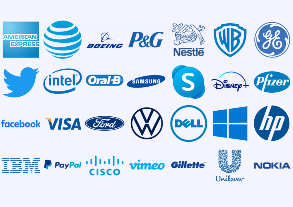
Blue — Trust, Reliability, Professionalism
Blue is the most universally trusted color in branding. It communicates stability, competence, and calm authority. Facebook, IBM, PayPal, and Samsung all rely on blue to signal that they are dependable and professional. It is especially effective in finance, technology, and healthcare.
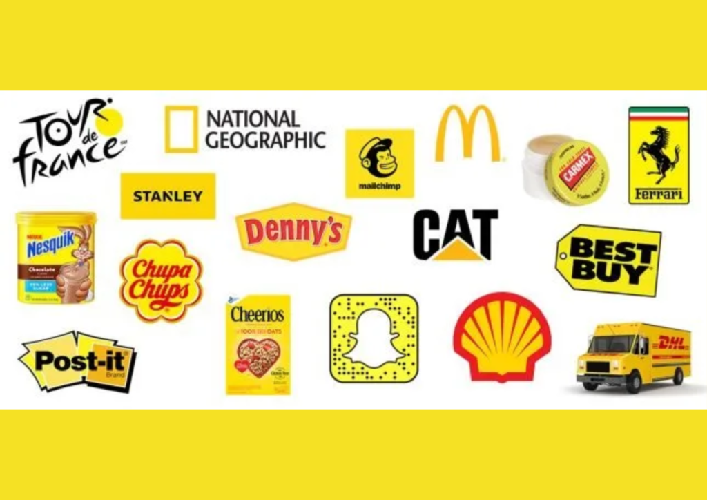
Yellow — Optimism, Warmth, Attention
Yellow is the color of sunshine and optimism — it lifts mood and draws the eye naturally. McDonald’s golden arches and IKEA’s bold yellow signage both leverage this energy to create a welcoming, positive feeling. Used in excess, yellow can feel overwhelming or low-quality, so most brands use it as an accent rather than a dominant color.
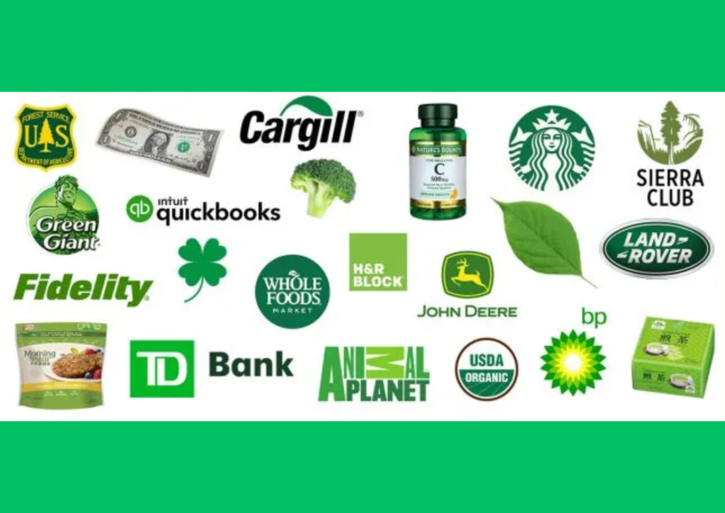
Green — Nature, Growth, Health
Green connects deeply to nature, freshness, and sustainability. Starbucks uses it to signal a natural, community-oriented experience. Whole Foods uses it to reinforce its organic positioning. Green also carries financial associations — money, prosperity, growth — which is why banks and investment brands sometimes reach for it too.
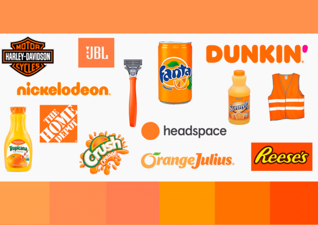
Orange — Enthusiasm, Friendliness, Innovation
Orange carries the energy of red but softened — it feels approachable rather than urgent. Amazon and Nickelodeon both use orange to communicate warmth, creativity, and accessibility. It works well for brands that want to feel dynamic without being intimidating.
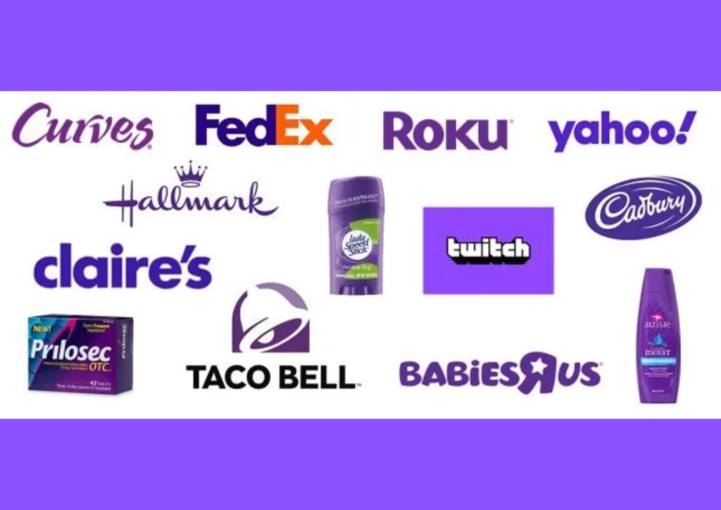
Purple — Luxury, Creativity, Wisdom
Purple has been associated with royalty and luxury for centuries — historically, purple dye was extraordinarily expensive, making it a symbol of status and exclusivity. Today, brands like Hallmark use it to communicate imagination and sophistication. It also performs well for wellness, beauty, and premium consumer brands.
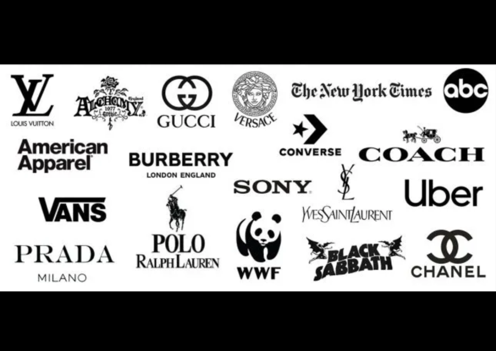
Black — Power, Elegance, Timelessness
Black is the color of premium quality and enduring style. Chanel, Nike, and Apple all use black as a core brand color to project authority, sophistication, and confidence. It works across virtually every industry when the goal is to communicate that a brand is serious, premium, and built to last.
Getting Strategic: Color Psychology for Business Logo Success
Choosing a logo color is not about personal preference — it’s a strategic decision that needs to account for three things: your audience, your industry, and the emotional response you want to trigger.
Know your audience
Research consistently shows that color preferences vary by demographic. Men tend to gravitate toward darker, more saturated colors — blue, black, and green. Women tend to respond to a broader spectrum of colors, with softer tones performing well. Age also plays a role — younger audiences respond to bright, vibrant colors while older audiences tend to prefer more muted, sophisticated palettes.
Know your industry
Color conventions exist in every industry for a reason — they set expectations that audiences have been conditioned to recognize. Technology companies favor blue and grey to signal professionalism and innovation. Food brands favor red and yellow because these colors genuinely stimulate appetite. Healthcare brands favor blue and green to communicate trust and wellbeing. Working within these conventions is not unoriginal — it’s strategic. Breaking them requires a deliberate and well-executed reason.
Know the emotional experience you want to create
What do you want someone to feel the moment they see your logo? Energized and ready to act? Red or orange. Calm and confident in your brand? Blue. Connected to nature and authenticity? Green. The emotion comes first — the color follows.
Building Brand Game Plan : Color psychology in Logo Design
A strong color strategy goes beyond picking a single color that looks good. It requires understanding how color meaning shifts across cultures, contexts, and combinations.
Cultural context matters
White represents purity and weddings in Western cultures — but in many Eastern cultures, it is the color of mourning. Red signals good luck and prosperity in China, but danger and warning in many other contexts. If your brand operates across multiple markets or cultural audiences, color research for each region is not optional.
Build a full color system, not just a logo color
Your logo color is the starting point, not the full picture. A complete brand color system includes:
- A primary color (your dominant logo color)
- One or two secondary colors (for supporting brand materials)
- Accent colors (for calls to action, highlights, and contrast)
Consistency across all of these is what builds recognizable brand identity over time.
Nailing Those Color Combinations
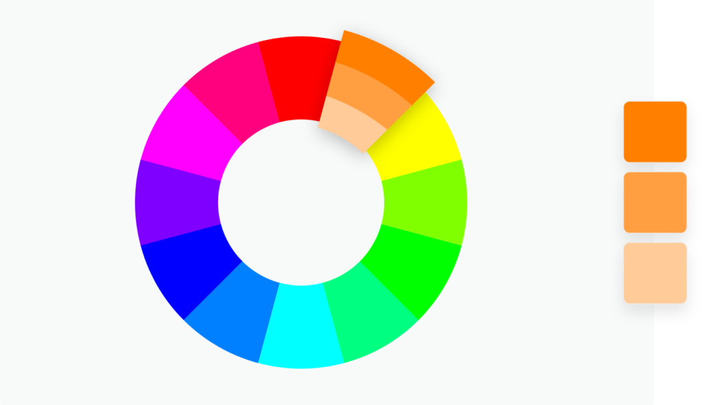
Understanding individual colors is only half the equation — how colors work together determines whether your logo feels harmonious or chaotic. Here are the five core color combination approaches:
Monochromatic — one color in varying shades and tints. Clean, elegant, and highly versatile. Works exceptionally well for minimalist and luxury brands.
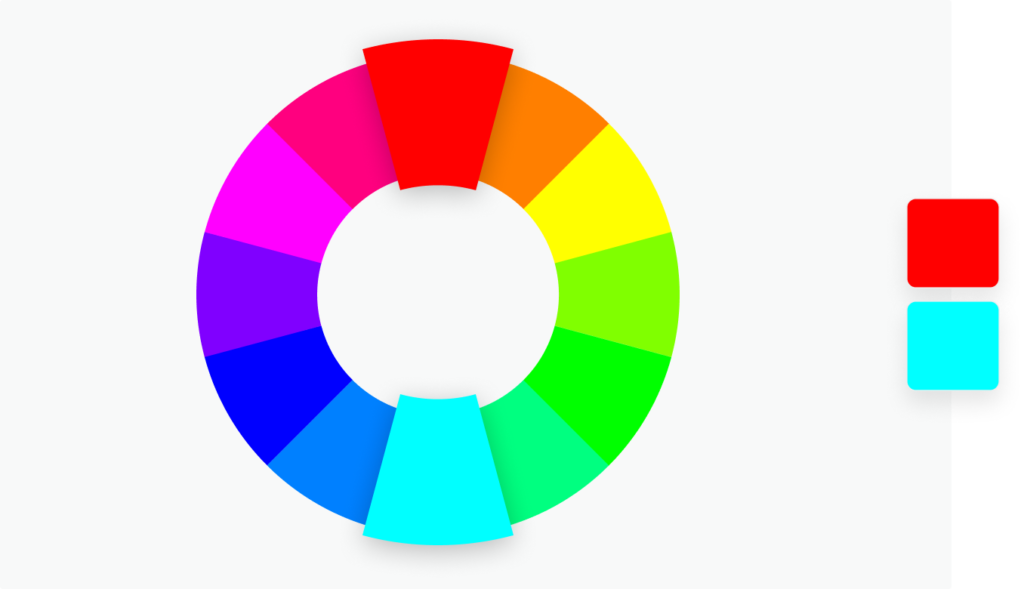
Complementary — colors opposite each other on the color wheel (blue and orange, red and green). Creates high contrast and visual impact. FedEx’s purple and orange is one of the most recognizable examples — professional but impossible to ignore.
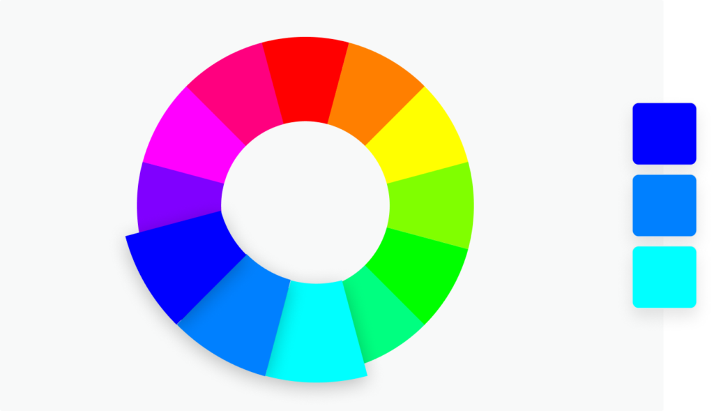
Analogous — colors sitting adjacent on the color wheel. Creates a smooth, harmonious effect. Subway’s yellow and green combination feels both fresh and natural, supporting their “Eat Fresh” positioning perfectly.
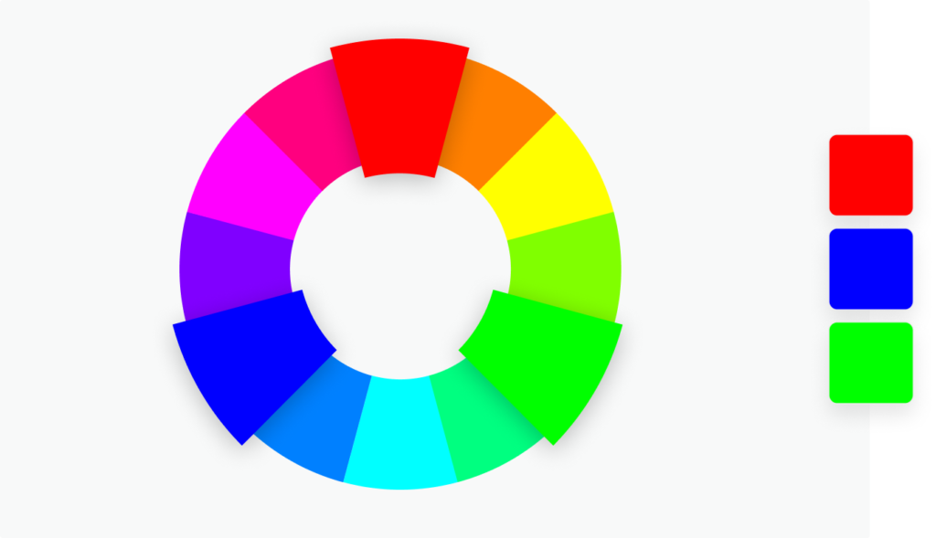
Triadic — three colors evenly spaced on the color wheel. Visually dynamic without feeling chaotic. Burger King’s red, yellow, and blue is the classic example — energetic and immediately appetite-stimulating.
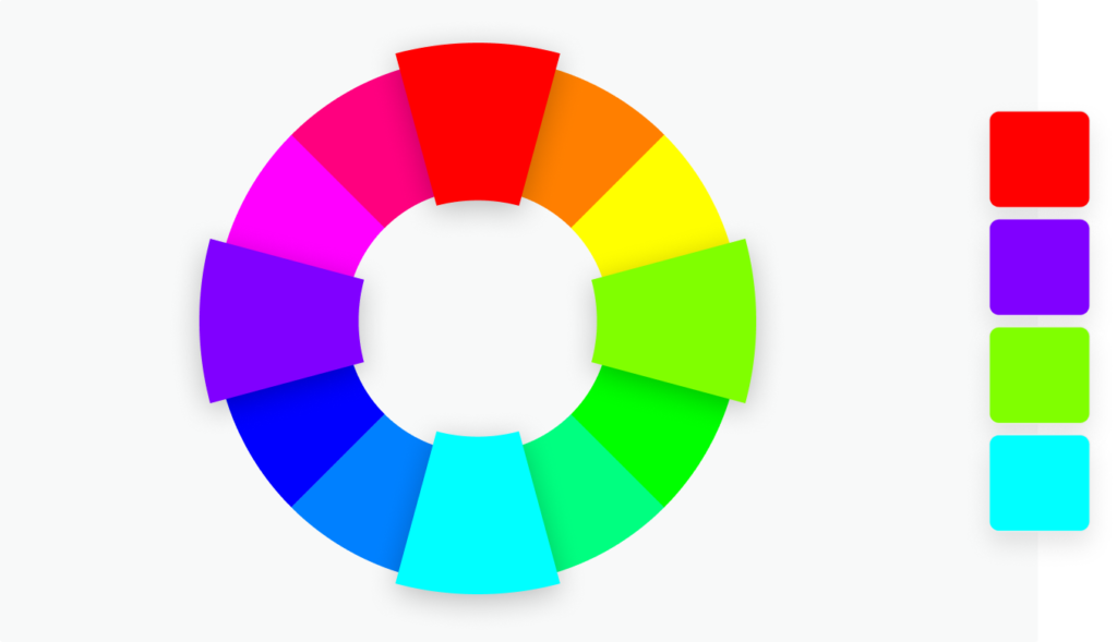
Tetradic — four colors evenly spaced on the color wheel. Bold and complex. Works best when one color is dominant and the remaining three serve as accents. The more colors in a palette, the more discipline required to keep the design balanced.
Whichever combination you choose, test it at every scale — from a small favicon to a large billboard, and on both light and dark backgrounds.
Making Color Psychology Work in Real Life
Start with brand personality
Before you open a color wheel, define what your brand actually stands for. Is it steady and trustworthy, or bold and disruptive? Is it playful and accessible, or refined and exclusive? Your colors need to reflect that personality consistently — not just in your logo but across every touchpoint.
Test with your actual audience
Do not make final color decisions based on your own preferences alone. Test your color options with real people from your target audience. What emotions do they associate with each option? What do certain colors make them think of? A/B testing different color versions of your logo or marketing materials gives you data instead of assumptions.
Build for flexibility from the start
Your logo needs to work in every context — full color on your website, black and white on a printed document, reversed on a dark background, small as a social media avatar, large on signage. Color psychology decisions that only work in one context are not fully realized brand decisions.
Final Thoughts
Color psychology in logo design is not a creative shortcut — it is one of the most evidence-backed tools in branding. The brands that use it well are not just making their logos look attractive. They are communicating who they are, building recognition, and triggering the emotional responses that drive real purchasing decisions.
Get the color right for your brand, your audience, and your industry — and your logo will be working for you every single time someone sees it, whether they realize it or not.
Explore More . Check Out My Linkedin Profile.